
COVID-19 Recovery Dashboard
An easy-to-use tool to help people stay safe and follow CDC guidelines.
Project Overview
Problem
Many people in the United States look directly to the Centers for Disease Control and Prevention (CDC) for information about COVID guidelines because it’s a trustworthy and authoritative source.
Because the CDC has so much to cover, their site is packed with dense information about COVID topics leaving many users overwhelmed by screens full of text and making it difficult for them to find the specific information they need.
While there are many dashboards dedicated to tracking COVID-19 infection rates and sites such as the CDC with extensive information on official guidelines and recommendations, there is not yet a personalized dashboard to help people quickly understand what they need to do while they are COVID positive.
Objectives
Design an MVP based on research to provide a personalized dashboard resource for infected individuals
Align with CDC branding + styling according to the US Web Design System
Scope
MVP Dashboard
Role
UX/UI Designer
UX Researcher
Tools
Figma
Duration
80 Hours
*This is a speculative project, with no affiliation to the CDC or the US Government
Design Process
Ideate
Brainstormed Solutions
User, Business, + Tech Goals
Feature Roadmap
UI Requirements
Task Flows
User Flows

Empathize
Competitor Research
After browsing various government pages detailing COVID-19, it was clear that these agencies are more focused on providing comprehensive information and less on creating thoughtful layouts to help users quickly find what they need.
In times of elevated stress, it’s especially important to provide users with concise information that is easy to understand.
Cons:
Abundance of text
Overwhelming amount of information
Pros:
Icons to break up text
Ample white space to reduce the amount of visual processing required
Interactive element to help user get specific instructions for their situation
Interview Plan
I asked each participant to tell me about their experience while they were sick, making sure to ask about:
Biggest concerns when they found out they were positive
What they knew already vs what they needed to research to find out
How they went about searching for information
What information was most valuable to them during this time
What frustrations they encountered along the way
User Interviews
In order to understand what users need from a COVID dashboard, I conducted remote user interviews over Zoom:
5 participants
Tested positive for COVID within the last 6 months
Did their own research to understand how to follow guidelines and/or care for themselves while sick
Interview Findings
The interviews confirmed my hypothesis that government COVID resources are too dense and can be frustrating or overwhelming to a person who tested positive and needs to find clear and official guidance.
My interview findings also confirm that most users go to the CDC site, in particular, in order to figure out how to take care of themselves and follow guidelines.
The most interesting and unexpected finding was how common it is for people to feel that they must take additional precautions even after they have been isolated for the recommended length of time based on their symptoms. This seemed to stem from a place of uncertainty that they had current and complete information and were understanding the guidelines correctly.
Key Findings
Not very concerned about personal health
Very concerned about exposing others
Trust the CDC to have official guidance, if there is any
Not confident in their understanding of the guidelines even after reviewing them
Confusing how to count isolation days
Still anxious about infecting others after recommended isolation period
CDC page is overwhelming
Too much text
Overwhelming amount of information
Hard to quickly find specific answers
Define
Empathy Map
Using quotes from my interviews, I put together an empathy map that allowed me to begin to see where there was alignment and division in user perspectives.

Introducing Robin
Identifying patterns among the interviewees allowed me to outline goals and frustrations that were representative of the majority of participants.
Robin isn’t feeling very well and has just tested positive for COVID-19. They are most concerned with understanding how long they need to stay home and whom they may have exposed.
Illustrating Empathy
I created a short storyboard to further convey Robin’s predicament of having access to a lot of information about COVID and isolation but not being able to find concise and easy to understand information that applies to them.
While they do learn some information, they don’t have the energy to fully grasp what they want to know, leaving them frustrated and anxious on top of the fatigue from their illness.
Building Problem Statements
Two prominent insights that emerged from research and creating Robin were that not only does Robin need to be able to quickly find and understand guidelines that apply to them, but due to the lingering anxiety that participants talked about having after their isolation period was over, it became clear that users were lacking confidence in their understanding of the guidelines.
I decided to create two problem statements in order to address the issue of confidence as well as simply finding and understanding the right information.
In order to create prompts for ideation, I took each of these statements and rephrased them into “How might we…” questions, allowing for space for liberal ideation in the next phase.

Ideate
Essential Tasks
To determine the most important flows through the dashboard, I focused on what Robin’s main objectives would be using this tool. I referenced my research to determine what specifically users wanted to know when reviewing guidelines. The top 3 things people wanted to know first were:
Isolation days
“How many days do I have to stay home and how do I properly count those days?”
Most contagious days
“I’m concerned about who I might have exposed so I want to know when I was most contagious to have a better idea of who may be at risk.”
Likely release date
“What day will I be able to leave my home and resume normal activities like work and my social life?”
Task Flows
Each of the above concerns would be addressed directly on the dashboard itself. But first, the system would need to collect information from the user about their infection status and progression. The first flow became the setup where the user would enter this information as part of the process of finding out how long they would need to stay away from others.
While not necessarily a conscious goal of the user, tracking symptoms is a required part of the isolation process as symptoms must be improving in order to end isolation. The next flow I sketched out was how the user would report and update their symptoms within the dashboard.
Lastly, to address the lingering concerns users had after reviewing the guidelines, I created a flow where a user would review the requirements for ending isolation and the precautions recommended for after isolation.
Exploring User Flows
Expanding the task flows into user flows allowed me to examine the interactions in more detail and identify opportunities to simplify the flow and make it more intuitive for the user.
The setup flow has one start point and 4 end points in order to allow users to skip some questions altogether that don’t apply to their situation.

Design
Dashboard Best Practices
Before beginning to sketch dashboard layouts, I put together a short list of UI goals based on research I did on what helps make a dashboard successful.
Single screen with minimal scrolling required
Priority information should be top left due to F and Z reading patterns
Minimal, concise use of text
Intuitive format
Visuals with clear explanations
Layout Sketches
Taking into account the objectives and concerns that informed the user flows, I sketched various layouts to explore how to best prioritize and arrange the sections in order to help the user find what they want to know efficiently.
Top Considerations:
Single screen with minimal scrolling required
User’s interest in each topic
F and Z reading patterns
Proximity implies correlation

Low to High Fidelity
Dashboard Intro
Setup Flow
Dashboard Home
Prototype for Testing
Test
Usability Test Plan
Using the basic flows I created in the hi-fi prototype, I conducted remote usability testing via Zoom:
6 participants:
3 who have had COVID-19
3 who have not had COVID-19
I wanted to make sure to test with some people who have not had COVID because I felt those people would likely be less familiar with the isolation process and I wanted to ensure the concise copy would still make sense to an individual who has not already done extensive research on the topic.
Test Objectives
Determine how the simple UI design of the dashboard relates to the effectiveness of the dashboard
Explore people’s comfort level with the ease of the setup process
Test the clarity of isolation duration and other information
Uncover any priority information that users feel the dashboard is missing
Determine if people feel like this is a resource that could save them time and effort when they are sick
Test Findings
Despite my concerns that the design and available information might be too simple, all participants praised the dashboard’s concision and a few participants even asked for more simplicity.
Not only did most participants state they would want to use a tool like this, but also 67% noted that they think the tool would significantly reduce stress in case of a COVID diagnosis. This is particularly notable because the participants volunteered this insight without being asked directly.
The setup process was easy to use and did not result in significant abandonment issues.
Study participants consistently noted each of these areas were clear:
Information provided is concise and easy to understand
Simple layout makes it easy to quickly see and process the info
Particularly true in regards to isolation duration
User’s priorities were reflected in the prioritization of content and layout. Users did not identify missing information that would limit adoption.
Desirability test results signaled high confidence in the dashboard. Informative, trustworthy, and professional were nearly consensus responses.
Actionable Takeaways
After reviewing test findings, I compiled a list of revisions based on user, mentor, and peer feedback. I prioritized these items into high, medium, low, and out of scope sections based on the value of the item to the business and the user compared to the effort required to implement each item.
-
When to seek medical care
“I assume the symptom tracker would tell me but some indicator would be nice.”
More accessible versions
Lower reading level
Bigger text, more contrast
Visual indication of connection/relationship between different parts of the dashboard
Clearer sense that the dates are up to date and that they might change depending on how the illness progresses
Clarify that dates are estimations and may change depending on the progression of the illness
Indication that time has past
Indication that user is on track for release date
More clarity on graph
Slightly larger
Make y-axis labels more clear
Different color lines
Indication when a symptom might become a concern to take to a doctor
Settings screen to adjust inputs that may have changed or been entered incorrectly
Option to not enter email
-
Interactive element to encourage people to inform people they have may have exposed
Tool to send automated emails to people you may have exposed
Choice to be anonymous
Links to CDC pages with more detailed information on certain topics
Resources for booking COVID test
When should I get tested?
How often should I get tested?
Information about how to protect family members or housemates
Exposure information: What to do if a person has been exposed
What do do while waiting to get tested
What if I can’t get a test appointment for a long time?
What to do if you have symptoms and have been exposed but are testing negative
Likelihood that you have COVID
Instructions on how to talk to other people about how you may have exposed them
-
Upload test result
Ability to see when people you know are sick or have been sick
Share status on social media
Calculator layout where a user could update fields on the page, click “update” and see the calendar change → also wouldn’t have to ask for email
-
Dashboard for businesses
How to follow guidelines
How to inform employees of possible exposures
What to do when there may have been exposures at the workplace
Iterate
Iteration
Testers valued the simplicity of the original design and encouraged an even simpler approach.
I also continued to value clarity, since the essential purpose of a dashboard is to provide users with clear information quickly.
I prioritized improvements to dates, because they are the information that Robin needs most. I then iterated through several approaches to the design.
Remove Distractions
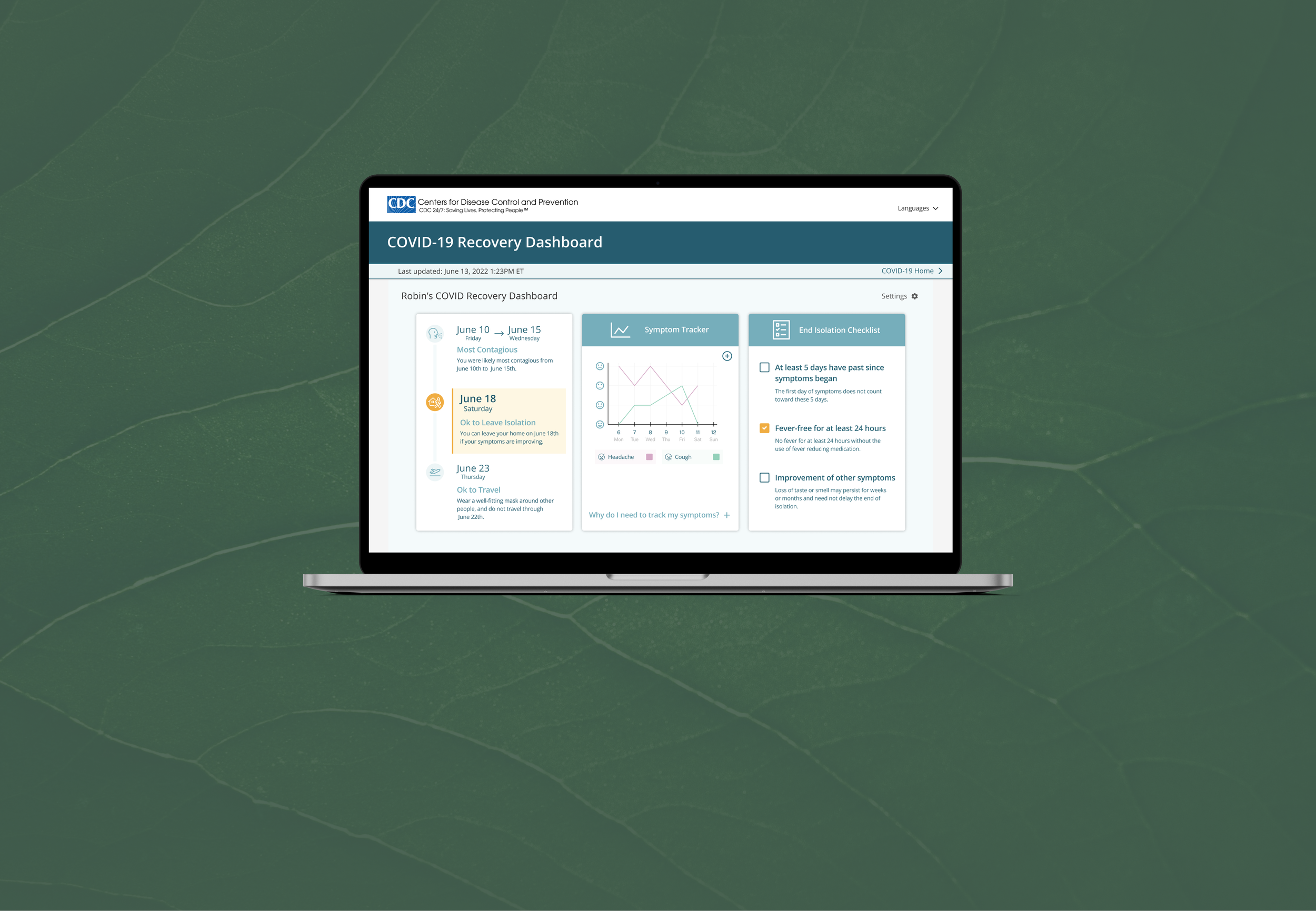
Leaving a large and clear header and the CDC logo but removing the navigation options both visually simplified the page and provided a prominent but not distracting place to display the update information to help the user feel confident that the information was accurate.
Highlight Important Dates
Improved clarity with left aligned text, chronological order, and smaller icons allowing the dates to be most prominent and the order to be more intuitive.
Color for Clarity
Introduced a darker yellow color to emphasize the end isolation date as well as the checked items on the checklist. Using the same color for these two items adds a visual connection implying the relationship between the two. Different color lines on the graph improve the clarity of information.
Screen Revisions
Landing
Update Symptoms
Landing with Symptom Data
In Case of Emergency
Additionally, inserting a “when to seek emergency medical care” link into the add-symptom flow would allow concerned users to check on this information while sick, but would not crowd the main dashboard or create additional concern among more anxious users.

Next Steps
Create alternate accessible versions like colorblind-friendly, big type, and “Easy-to-read” (under 3rd grade reading level for people with cognitive disabilities)
Validate updated designs with user tests
Clarify whether checklist is updated by user or system and explore other possible interaction opportunities