

*boop* End-to-end MVP App
An app to help dog owners plan outings with their dogs and connect to the local dog-loving community.
Project Overview
Problem
One of the great joys of having a dog is finding dog-friendly spaces where a person and their dog can venture out of the house together. While there are apps that can be used to find these spaces, from Google Maps to Yelp, there are not many apps dedicated to helping dog owners find parks with specific features that they and their dog value or require.
Objectives
Create a new MVP mobile app
Design delightful branding to engage users
In this project, I have created an end-to-end MVP app to help simplify a dog owner’s planning process. The app provides owners with reliable information sourced from, and updated by, other local dog owners.
Scope
MVP Mobile App
Branding
Role
UX/UI Designer
UX Researcher
Tools
Figma
Duration
80 Hours
Design Process

Empathize
Topic Research
Exploratory topic research uncovered a common factor across many related apps: helping users find information about places to take their dog. This got me thinking:
What factors play into a dog owner’s decision to take their dog on an outing with them rather than leave the dog at home?
Exploring User Thoughts
I performed five one-on-one remote interviews, from which I drew the following conclusions:
Dog owners care deeply about their dogs and go to great lengths to provide enriching, safe experiences.
Often when an owner chooses to leave their dog at home, it is because:
They know their destination would not be safe or enjoyable for the dog
They can’t find enough information to know for sure
Define
User Persona
Empathy mapping revealed a persona, Anna: an anxious and organized dog mom to a pit bull named Bruce.
She has recently moved to a new state and works from home — and taking Bruce to new places is a big motivating force to get out of the house.
Building Problem Statements
I used Anna’s needs to pose three questions that I would use as a jumping off point to brainstorm a variety of possible solutions:

Ideate
Brainstorming Solutions
Based on these solutions, the app began to look like a social app for dog owners that also contained a community-sourced database of dog-friendly locations from parks to restaurants.

Prioritizing Solutions
MoSCoW prioritization yielded some important “Must Haves:”
A social feed
Search functionality for places and dogs
Playmate matches
Filters for posts, pages, and places all based on a tag system
A messaging system between users

App Goals
Considering the high priority items from the roadmap along with the problem statements, these goals emerged and could later help measure the success of the product.
Give Anna more information about dog-friendly locations
Encourage Anna to interact with other local dog owners
Help Anna meet new dogs that Bruce might get along with
Help Anna trust the information provided
Iterating Problem Statements
I decided to focus mainly on my first problem statement: “How might we help Anna decide where to take her dog?”
By refining that statement, I could capture the benefits of the other two problem areas: finding dogs, and finding owners.

If my main goal was to help Anna decide where to take her dog, what would be more helpful than Google Maps?
A simplified concept focused only on dog parks would reduce Anna’s uncertainty and make a good starting point for MVP.
Task Flows
I sketched flows for Anna’s main objectives:
User Flow
The task flows I created for confirming hours and finding busy times at the park were fairly concise, so I created a user flow just for the first task. This user flow highlighted the potential conflict or complications that could occur with separate search, filter, and browse features.

Design
Iterative Sketches
Based on a bank of UI ideas, I created three wireframe sketches for each essential screen:
Home
Search results
Park information
Check-in Flow
In my next iteration, I sketched screens for a check-in flow and a search-within-the-comments flow. These sketches yielded a feature idea for the check-in flow: to ask questions that would confirm the community-sourced information and increase Anna’s overall trust.
But after I considered concerns about abandonment rates, I decided not to add another step to check-in.
Sketches to Lo-Fi Wireframes
Incorporating feedback, I updated my sketches.
I also anticipated an issue with understanding icons, since they would not all be common. My sketches received feedback that icons should expand when tapped; that way, they would be compact upon arrival to the page but easily clarified in case of confusion.
Mid-Fi Screens for Prototype
The expand-contract design language also helped remove steps from two other workflows: additional park details, and search-within-comments.
In my second iteration used for testing, I designed the park-activity graphs to expand/contract upon tap, and allowed Anna to search comments directly from the park screen, eliminating 2 screens from the flow.
Test
Testing Parameters
I tested with a mid-fi prototype to get early feedback without the distractions of colors and images.
5 dog owners
Remote testing
User observation with think-out-loud direction
Follow-up discussion
Test Goals
Beyond the basic usability test goals to improve the product by uncovering confusion or pain points, I created three test objectives:
-
Explore the ease with which users were able to find information about a hypothetical weekend plan with their dog.
-
Stemming from the dichotomy of intent versus discovery, the home screen of the app is mostly devoted to an interactive map which I designed to encourage exploration. Similarly, the search functionality is in a familiar location (top right corner) but I left it as a simple search icon without emphasizing it otherwise. I was curious to see how this design affected the test users’ interactions, and if any obvious benefits or drawbacks would emerge.
-
While the main problem I designed around did not explicitly state anything about connecting to a community, my user Anna wanted to meet both people and dogs. I believe community connections are an essential way for Anna to ease her anxiety and build trust. I think she will value the information the app provides more, knowing that it is sourced from people who care about similar things.
Test Tasks
Usability test subjects each attempted to complete these tasks:
-
You open the app and would like to find a park to take your dog Bruce this weekend. You like to take Bruce to the park when there are lots of dogs there because you like giving him opportunities to be social and he is more likely to burn more energy when there are many dogs to play with.
-
This area is new to you so you want to make sure the park will be open over the weekend. You also want to see if one day might be busier than the other because you would like to go when the park is very active.
-
You are anxious about having a negative interaction with other dog owners who buy into stereotypes about pit bulls. You would like to try to understand how people at this park feel about pit bulls.
Mid-Fi Prototype
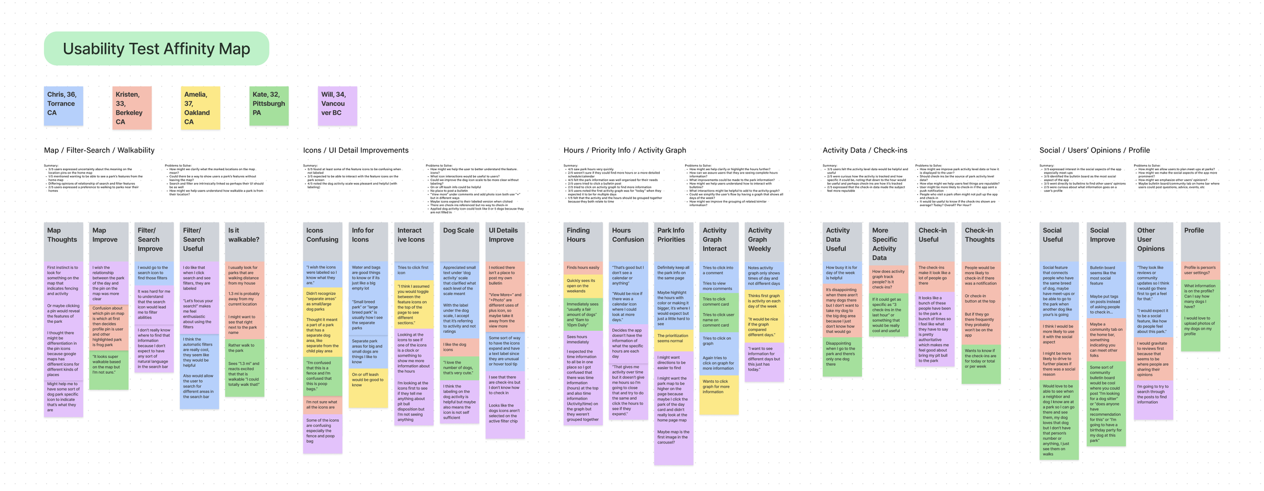
Test Findings
I reviewed video recordings, took thorough notes, and counted the number of errors each tester made before completing each task.
With an average error rate of 1.8, the first task in usability seemed to give testers the hardest time. The majority of errors on the first task were because the testers attempted to interact with the pins on the map. While this technically got in their way based on how the prototype was designed, it shows that the map had the intended effect of encouraging users to explore.

Destiling Data
Using notes from an affinity map, I identified possible solutions to implement and used a Value/Effort rating system to prioritize them. I implemented almost all the high priority items as well as some medium items.
Planning Revisions
I did not implement one high-priority item: a Community Section that would act as a bulletin board. I do think this would be an important eventual feature for the app, but it did not directly apply to my problem statement. In other words, without this feature, Anna still had a minimum, viable solution to her most important problems.

Branding
Branding
I branded the app last. Presented with five key words to capture the app’s tone, users suggested orange, which captures the fun and energetic tone I wanted to convey. I chose a teal to contrast the orange to evoke a community-oriented and welcoming tone.
I chose the name “boop” for the app to capture the excitement and energy when two dogs meet: that adorable moment when their noses tap together.

The updated, branded prototype is ready for additional usability testing to iterate on my findings. I also created a UI kit that engineers could use to begin development.

Hi-Fi Prototype

Project Insights
My discovery and design were highly research oriented. Some key insights I drew from this research were:
Dog-specific trip planning tools would help both owners and dogs meet each other, improving their lives.
Dog owners’ social needs and anxieties are not adequately met by mainstream mapping apps.
Constraining the app’s focus to trip planning addressed a range of socially oriented problems, without the additional complexity and scope of social media features.
An open-ended map landing page encouraged exploration, but meant a good search and filter UX was essential to provide the user with direction and control.
Overall Insights
-
A persona with a clear problem to solve is essential to MVP thinking. Refocusing on Anna’s needs allowed me to narrow my scope at a number of crucial moments in the project.
-
Frequent interviews with a cohort of users provides clarity in most phases of design, from initial problem brainstorming to UX fine-tuning.
-
Designs oriented toward intent are different from designs oriented toward discovery, and a strong choice between those goals helped me find a clear direction for important workflows.
-
A balance of qualitative tools (such as affinity mapping) and quantitative tools (such as errors per task) gave me different types of insight into users’ needs.