
Improving Apple Notes
An organizational feature to help casual users experience less stress.
Project Overview
Problem
In line with Apple’s philosophy of creating simple, easy to use tools, Notes came from humble beginnings but has slowly built up a number of powerful features. Despite the improvements, many iPhone users opt to download and possibly even pay for third party note taking apps while still occasionally using Notes.
Why are users adopting this app but not using it heavily?
Objective
Identify a problem space of users of note-taking apps
Incorporate a new feature into Notes offering a solution
Scope
Mobile Design
Brand Alignment
Role
UX/UI Designer
UX Researcher
Tools
Figma
Duration
80 Hours
*This is a speculative project, with no affiliation to Apple

Empathize
“We believe in the simple, not the complex.”
- Tim Cook, Apple CEO, on the company’s core values
Exploration
During my exploratory research, I noticed there were two major types of note apps:
Stripped-down apps that simply provide users with a digital notebook
Feature-rich apps that provide users with various organizational tools
The Competition
I found that Evernote, Google Keep, and Microsoft OneNote seemed to be popular and highly recommended by various users. Evernote and OneNote stood out to me as the more complex and powerful note-taking apps while Google Keep and Notes struck me as the stripped-down counterparts.
While I was correct that Google Keep is the most simplified app out of the set, I found that Notes was much more competitive with Evernote and OneNote.
While Notes started out with very basic note-taking functionality, after years of iterations it has become a quite powerful tool.
Exploring User Thoughts
Interview subjects were selected based on their commitment to the Notes app: all 5 participants use Notes sometimes but also use a different app for notes or lists. This allowed me to investigate reasons why users choose one app over the other and discover pains that could be keeping them from fully committing to Notes.
After speaking with 5 casual Notes users, I gathered detailed notes and organized them into an affinity map. This allowed me to identify the three most prominent topics based on how often topics were mentioned and how many users mentioned similar things.

Interview Themes
Unknown features
“I’m sure there is a way to address it but I’m too lazy to figure it out.”
Shared lists
“I like being able to share lists with my partner like a grocery list.”
Disorganization
“I have to go back a bunch & it's all disorganized. And sometimes I can't even find it.”
Key Insights
Notes is far more functionally complex than people know or think.
Users often requested features without knowing those features were already in the app
Many users also use competing apps because they believe those apps have unique features they need
Nearly all users are unwilling to learn about new Notes features
Would follow up with a feature comparison chart given a more in-depth project
Notes is used heavily as a catch-all for “random” notes.
Sharing is a crucial use case for Notes.
Who Are the Users?
Casual users don’t want to invest time into organizing their notes.
This is an important and underserved group — between basic users and power users. They use Notes to capture various bits of information they want to remember which build up over time, resulting in a perpetually expanding list of notes.
These users need some of Notes’ advanced functionality, but are unwilling to invest significant time to discover it themselves.
Define
Empathy Map
Using direct quotes from my interviews, I used an empathy map to synthesize information from interview participants and get in the mindset of a casual Notes user.

User Persona
Sage’s goals and frustrations echo those of many of the interview participants.
While she uses Notes for shared grocery lists with her partner, she also uses the app as an eclectic catchall. She records a lot of creative thoughts in Notes, so she does often get frustrated when she wants to access her grocery note quickly but has to scroll down past all her poems from the week in order to do so.

Narrowing the Scope
While creating a journey map focused on Sage interacting with her grocery list in Notes produced some hypothetical insights, my biggest realization was that I had not asked interview participants to walk me through the process of actively interacting with their lists. It was clear that there wasn’t enough data to support further examination of list-making as a main use-case.
But, even in a list-focused journey, the feeling of uncertainty and disorganization still emerged as an important user problem. This was better grounded in my research, so I chose to focus here. Ultimately this represented an important narrowing moment in my design thinking.

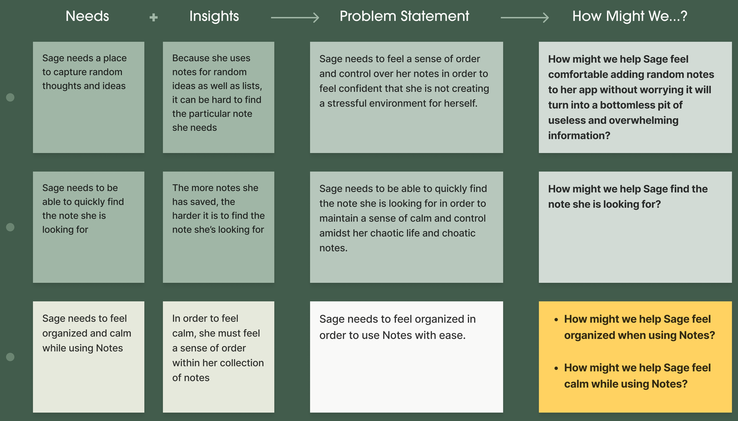
Building Problem Statements
With disorganization and discoverability in mind, insights and the needs associated helped create a set of problem statements. The third statement was selected for its concision and used to create two ‘How Might We…?” questions.
Ideate
Brainstorming Solutions
I organized a time-boxed collaborative brainstorming session with a professional project manager consisting of two rounds of rapid ideation for these questions:
How might we help Sage feel organized when using Notes?
How might we help Sage feel calm when using Notes?
I included the second HMW question out of curiosity. Feeling disorganized was causing Sage to feel stressed. One could extrapolate that means if we help Sage feel organized, she will feel calm. How to help a person feel calm is a difficult question to answer, so naturally I wanted to see what we came up with.
Brainstorm Themes
Visual Differentiation
Exploring methods to reduce user stress by breaking up the sheer amount of solid text that exists on the Notes list page.
Organize by note type
Related to increasing the user’s sense of organization by providing various ways to reorder the list of notes.
Assist with organization
Options that might help the user feel organized and calm by automatically implementing an organizational structure or making suggestions to help the user implement an organizational structure.
Reminders
Ways to help the user feel more organized by either reminding them of a note from their past or to remind them of a note at a specific scheduled time.
I kept thinking about how users are getting stuck in a vicious cycle: the more they use the app, the harder it becomes to use. I felt I must try to disrupt this cycle.
Selecting a Feature
Feature Goals:
Help casual users add an organizational structure to their notes
Reduce stress caused by disorganized notes
Help user feel safe adding new notes without fear of clutter
Iterating on Tags
Notes’ recently released feature, Tags, helps with two of the themes — it visually differentiates notes & organizes them. Rooted in the previous insight that the casual user doesn’t want to spend time looking for or researching new features, my solution space was to extend this feature to include the other two themes: assistance and reminders.
The tags feature allows users to create their own categories, which can be viewed in the folders screen. Problem: Casual users don’t use the folders screen.
“The folders screen is overwhelming as *redacted*, I never use the folder section.”
- Usability test participant
Bring the Feature to the User
Tags have the potential to help get these users’ notes in much better order, but only if the app meets them halfway — or more specifically, meets them where they are: the Notes list screen.
Design
Getting to the Screens
This approach is intended to introduce Tags to casual users in a minimally intrusive way by inserting them into the user’s typical workflow. This will help show the users how to use Tags and help them quickly see how they might simplify and easily organize their experience.
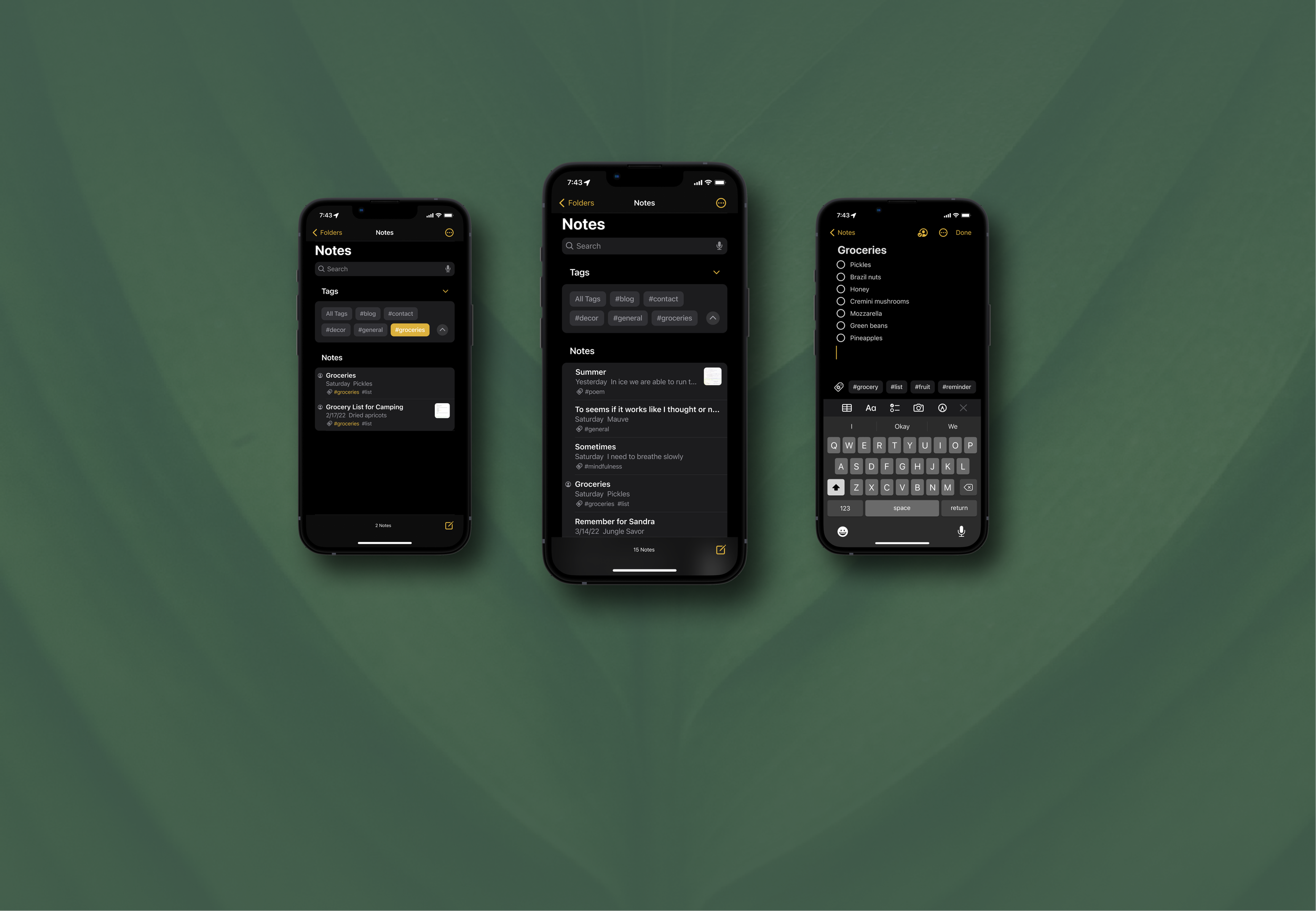
Notes List Screen
Placing the Tags at the top of the notes list page will be effective because they will be right beneath the search field: users may recognize them to have filter abilities because these elements are intrinsically linked.
Additionally, the displacement of the list of notes below will in effect allow the user to see less notes at once when they first open the app. I hypothesize this may help the users feel more calm when using this screen.

Note Screen
I propose that when a user is editing a note, the app suggests a group of relevant tags. The user can then select as many tags as they feel fit. The suggestions are positioned so the user can interact with them, but they don’t disrupt the user’s flow.

Test
Usability Testing
I needed to take my design changes to the users to understand if the updates were helpful and to gather any feedback that I could. I made a list of questions to find answers for via usability testing.
Test Objectives
Objectives were to answer these questions:
Do the users interact with the Tags or suggested Tags?
Do the Tags disrupt the users’ flow?
Do the users understand that tags are suggestions, rather than defaults or a required step?
Do the Tags help users access a note quickly?
Do they think the Tags as filters would be useful?
Do the users prefer seeing less notes on the notes list screen?
Do the UI additions crowd the screen?
Methods
Two short flows:
I observed users complete two small tasks within the prototype I designed to determine the level of interaction and ease of access.Follow-up interviews:
I asked the users a few questions around how they expected things to work in the prototype.Two preference tests:
I asked for users’ preferences to determine whether a screen with fewer notes would feel less crowded, even if it contained the additional tag element.

Key Findings
My test flows, interviews, and preference tests resulted in several clear signals:
Testers quickly understood that the tags would help them organize notes
Most users assumed that the tags were suggestions
The tagged page made every user feel more organized/calm
New elements did not contribute to a feeling of clutter
Interaction was high: users were curious about the feature
Users wanted to know how to make their own tags (indicating a sticky feature — these users never created a tag before)

Iterate
Revised Screens
Some test findings required changes to the design. In particular, I discovered:
Smart tags should not be differentiated from the basic tagging feature. Prototyping revealed that these features are not different enough to behave as different features.
This raised some product-level questions that I couldn’t answer within the scope of this project, but it would be a useful area for follow-up with a team.
More clearly visually differentiate tags when a filter is turned on. Several users suggested this improvement directly during their interviews.
I implemented this change.
Allow users to disable tag suggestions. Having an AI service reading Notes raises potential privacy concerns.
I partially implemented this change by allowing users to remove tags from list view. This is another area that would benefit from the input of a development team in a longer-term project.


Next Steps
I raised a number of questions that would benefit from additional collaboration with developers or product experts:
How does this AI work and how do we optimize suggested tags for usability?
How does this handle multi-language support?
Do we need to allow users to disable this AI?
Overall Insights
-
Notes is way more powerful than most users know.
Through research, I found that there is a large group of casual users who use Notes occasionally or often, but they do not feel like their needs are being met. Many of the features these users want already exist in Notes, but the users don't know they are there.
-
Meeting users halfway with suggestions can preserve simplicity while improving discoverability.
By embedding tags within a workflow that users were already engaged with, and reducing the effort to use them, I was able to drive adoption of the tags feature while improving the users’ overall perception of a simple, uncluttered design.
-
More exploratory research on users’ existing workflows would have helped.
Notes is used for a really diverse range of needs, from grocery lists to poetry. During journey mapping and persona writing, I found myself wishing that I could look to research for more insights into these workflows, so that I could have explored more potential feature areas. Visual tours or screenshots of users’ existing notes would have helped my exploration as well.
-
Overall, the feature was very well received by users.
My usability study validated both that the problem space was important to Notes users, and offered a clear signal that my solution would meet some core design values of Apple while improving feature adoption.